Accessibility Headings Introduction
In our introduction to semantic elements, you learned to use the heading elements.
A heading is text that describes the content that follows it.
What you might not now, is that headings are important for accessible navigation. Sighted users scan a web page to understand the structure of the page. The same way, screen reader users use headings to navigate and scan the page.
The headings must be clear, both visually and use clear wording. The heading structure of a page forms the outline of the page. You might think of this like the skeleton of the page.
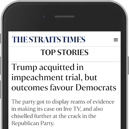
News papers use a lot of headings. The front page of The Straits Times has over 80 headings.

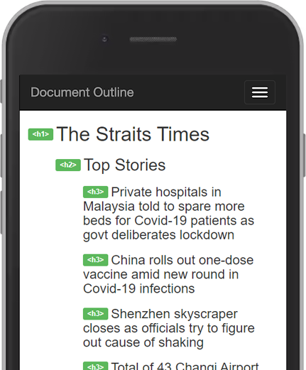
All these headings form an outline.

This is a good document outline. The levels make sense. The text is clear.
In the next module you will learn about assistive technologies and screen readers. As a teaser, you should watch Rob Dodson from Google demonstrate the importance of headings when using a screen reader. The first five minutes of the video explains the use of headings in a screen reader.
