CSS Grid Layout Module
Header
Menu
Main
Right
Footer
Grid Layout
The CSS Grid Layout Module offers a grid-based layout system, with rows and columns, making it easier to design web pages without having to use floats and positioning.
Browser Support
The grid properties are supported in all modern browsers.
| 57.0 | 16.0 | 52.0 | 10 | 44 |
Grid Elements
A grid layout consists of a parent element, with one or more child elements.
Example
<div
class="grid-container">
<div class="grid-item">1</div>
<div
class="grid-item">2</div>
<div class="grid-item">3</div>
<div class="grid-item">4</div>
<div
class="grid-item">5</div>
<div class="grid-item">6</div>
<div class="grid-item">7</div>
<div
class="grid-item">8</div>
<div class="grid-item">9</div>
</div>
1
2
3
4
5
6
7
8
9
Display Property
An HTML element becomes a grid container when its display property
is set to
grid or inline-grid.
All direct children of the grid container automatically become grid items.
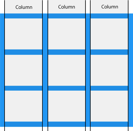
Grid Columns
The vertical lines of grid items are called columns.

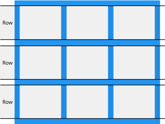
Grid Rows
The horizontal lines of grid items are called rows.

Grid Gaps
The spaces between each column/row are called gaps.

You can adjust the gap size by using one of the following properties:
grid-column-gapgrid-row-gapgrid-gap
Example
The grid-column-gap property sets the gap between the columns:
.grid-container {
display: grid;
grid-column-gap: 50px;
}
Example
The grid-row-gap property sets the gap between the rows:
.grid-container {
display: grid;
grid-row-gap: 50px;
}
Example
The grid-gap property is a shorthand property for the
grid-row-gap and the
grid-column-gap properties:
.grid-container {
display: grid;
grid-gap: 50px 100px;
}
Example
The grid-gap property can also be used to set both the row gap and the
column gap in one value:
.grid-container {
display: grid;
grid-gap: 50px;
}
Grid Lines
The lines between columns are called column lines.
The lines between rows are called row lines.

Refer to line numbers when placing a grid item in a grid container:
Example
Place a grid item at column line 1, and let it end on column line 3:
.item1 {
grid-column-start: 1;
grid-column-end: 3;
}
Example
Place a grid item at row line 1, and let it end on row line 3:
.item1 {
grid-row-start: 1;
grid-row-end: 3;
}
All CSS Grid Properties
| Property | Description |
|---|---|
| column-gap | Specifies the gap between the columns |
| gap | A shorthand property for the row-gap and the column-gap properties |
| grid | A shorthand property for the grid-template-rows, grid-template-columns, grid-template-areas, grid-auto-rows, grid-auto-columns, and the grid-auto-flow properties |
| grid-area | Either specifies a name for the grid item, or this property is a shorthand property for the grid-row-start, grid-column-start, grid-row-end, and grid-column-end properties |
| grid-auto-columns | Specifies a default column size |
| grid-auto-flow | Specifies how auto-placed items are inserted in the grid |
| grid-auto-rows | Specifies a default row size |
| grid-column | A shorthand property for the grid-column-start and the grid-column-end properties |
| grid-column-end | Specifies where to end the grid item |
| grid-column-gap | Specifies the size of the gap between columns |
| grid-column-start | Specifies where to start the grid item |
| grid-gap | A shorthand property for the grid-row-gap and grid-column-gap properties |
| grid-row | A shorthand property for the grid-row-start and the grid-row-end properties |
| grid-row-end | Specifies where to end the grid item |
| grid-row-gap | Specifies the size of the gap between rows |
| grid-row-start | Specifies where to start the grid item |
| grid-template | A shorthand property for the grid-template-rows, grid-template-columns and grid-areas properties |
| grid-template-areas | Specifies how to display columns and rows, using named grid items |
| grid-template-columns | Specifies the size of the columns, and how many columns in a grid layout |
| grid-template-rows | Specifies the size of the rows in a grid layout |
| row-gap | Specifies the gap between the grid rows |
